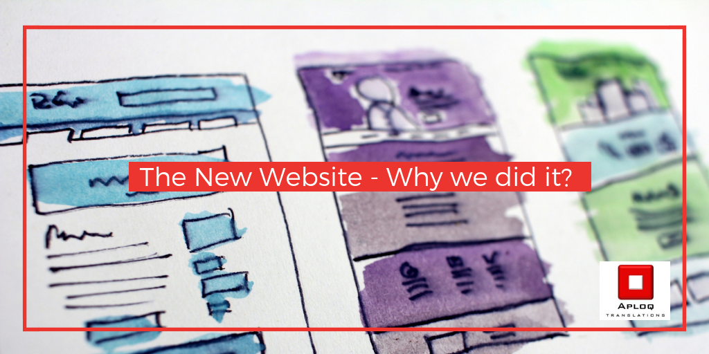

The New Website – Why we did it?
The Early Days
Aploq was founded in 2008 and you can imagine how much technology has improved since then, especially when it comes to all things internet – Think of Myspace, Blogger, Early Facebook, Bebo, Friendster and all the OG social media platforms, a lot of people were still afraid of the world wide web then, so we needed a change! Marketing was different and a lot of business websites were static and never changing – but we like change. We believe in being bold and saying it like you mean it, and our website simply wasn’t speaking in a way that we would like it to.
Aloq has gone from strength to strength since 2008 and we wanted a more bright and energetic colour scheme to truly reflect what Aploq has become and how it’s growing and to reflect our company’s personality better.
Our old website was clunky and hard to navigate, we didn’t feel that it was giving the right impression or conveying all that we do. We needed a website to communicate better with people as soon as they clicked on it! We wanted to give visitors easy access to essential information and to encourage them to get in touch. We also wanted our website to be a place more suited to share knowledge as it’s part of our marketing strategy.
Sourcing a company
When it came to sourcing what company that we were going to get to give the website a much-needed facelift, we wanted providers who could really see our vision and better understand our needs. We found that Retro Digital understood us the best out of all of the providers we were in contact with and they also had knowledge in our industry which was a huge bonus and we have been working with them ever since.
The Brief
When it came to the actual design of the website we knew what we wanted it to convey and communicate with our clients but only had a very general idea of what that would look like. Our brief to Retro Digital was that we would like a lighter website with more colours and unique graphic elements, which is exactly what we got – although it was surprising to see so much pink, it wouldn’t be the first colour that we would put with red but it suits Aploq and stands out amongst the crowd – a unique combination!
Was it worth it?
Since updating our website we have seen a slow but progressing shift in the way new clients find us! Which is down to SEO and a new website that is easier to navigate, full of knowledge and attractive. We have had some interesting inquiries and jobs coming our way already, making it a worthwhile investment!
We hope this may have inspired you to give some much-needed attention to an aspect of your business you have been neglecting! We are here for all your linguistic, translation and localisation needs! Happy New Year and remember – #sayitlikeyoumeanit